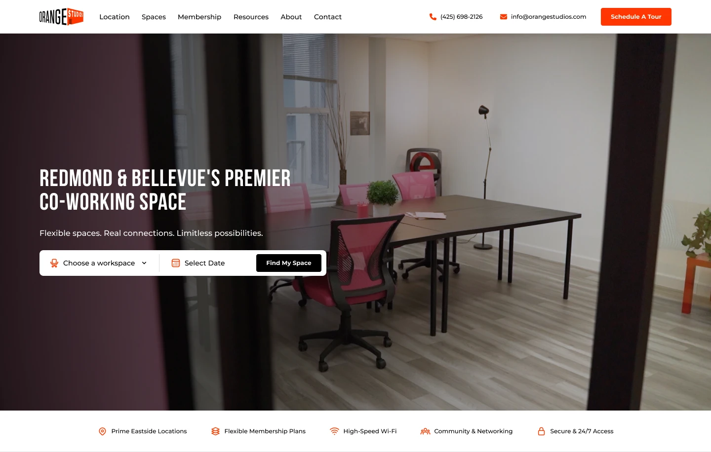
01 / THE CHALLENGE
The space has to feel right—and fit the day.
Photos can communicate atmosphere quickly. They cannot answer every question about a workspace. The website also needs to help someone compare locations, understand the offer, and decide whether to visit.
A visually expressive introduction works best when the practical information is equally considered. The balance changes as someone moves from browsing to comparing a membership.
02 / MY ROLE & APPROACH
Balancing the space and the practical details.
I developed the website’s visual direction across the landing, location, and membership experience. The challenge was carrying the atmosphere of the spaces into a site that also answers practical questions.
Project timeline · design phases
- 01
Frame the task
Define what a prospective member needs to compare.
- 02
Organize the experience
Connect brand, locations, memberships, and contact.
- 03
Resolve the interface
Develop the visual direction across page types.
- 04
Prepare for execution
Consider image behavior and responsive page sections.
03 / INFORMATION ARCHITECTURE
Location, membership, and enquiry.
The main areas of the product, and the information each one needs to keep together.
Discover
- Brand introduction
- Workspace photography
- Amenities
Compare
- Locations
- Memberships
- Specifications
Connect
- Resources
- Contact
- Visit enquiry
04 / USER FLOW
From exploring the space to planning a visit.
A useful flow needs to account for what happens when someone cannot take the next step immediately.
- 01Discover the space
- 02Compare locations
- 03Review membership
- 04Arrange a visit
The first location is not a fit?
Compare another location and its membership details before making contact.
05 / DESIGN DECISIONS
Giving visitors enough to decide.
Introduce the space through photography
Large workspace images lead the page. Navigation and actions remain clear so the visual introduction does not get in the way of finding practical information.
Give locations their own detail
Location pages bring the space and its amenities into context. They support evaluation after the initial impression.
Carry the visual language into membership
Membership, specifications, resources, and contact pages extend the same direction. The site supports a considered decision rather than relying on the landing page alone.
06 / THE WORK
A closer look at the details.
Explore the screens below. Scroll through a longer page or open it for a closer look.
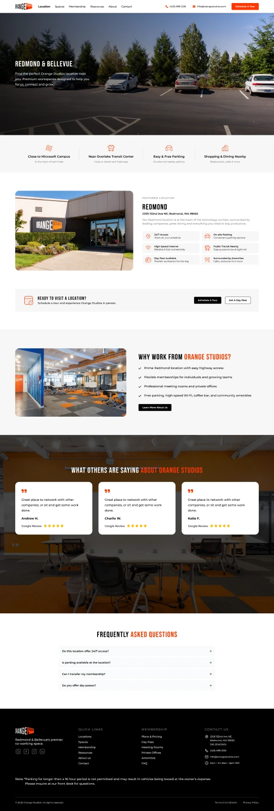
Location-specific content combines the feel of the space with information for planning a visit.
Open full design ↗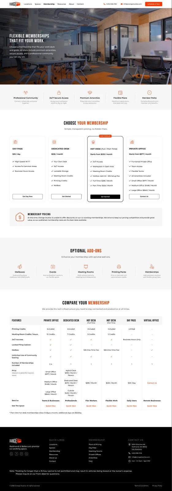
A dedicated page supports comparison after the initial brand introduction.
Open full design ↗07 / DESIGN INTO DEVELOPMENT
Keeping imagery and enquiry usable.
Large photographs should be responsive and sized to the viewport. Reusable location and membership sections can keep the visual rhythm consistent while allowing different amounts of content. Enquiry forms need useful labels and clear submission feedback.
08 / REFLECTION
From a first impression to a possible visit.
The concept connects the brand’s visual direction to location and membership content. A useful next check would be whether a prospective member can shortlist a space and explain what the relevant membership includes.
I would ask visitors to shortlist a location and explain the relevant membership. Tour enquiries, comparison difficulty, and unanswered questions would guide the next iteration.