01 / THE CHALLENGE
Summary and detail need to work together.
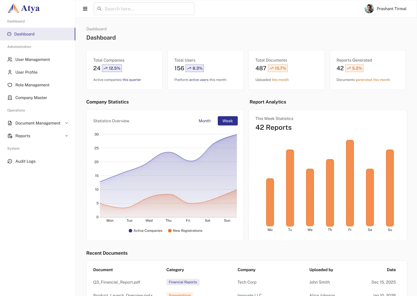
An operational overview should help someone decide where to look next. Atya pairs summary cards and charts with record-based administration, keeping both within a shared navigation system.
More information does not automatically make an overview more useful. The hierarchy needs to distinguish the information that deserves attention from the information that is available on demand.
02 / MY ROLE & APPROACH
Bringing reporting and administration together.
I worked on the dashboard structure and its related administration screens. Wireframes establish the reading order; the finished interfaces carry a consistent navigation and table pattern into user and role management.
Project timeline · design phases
- 01
Frame the task
Separate an operational overview from record editing.
- 02
Organize the experience
Establish navigation and management-page wireframes.
- 03
Resolve the interface
Develop dashboard, user, and role interfaces.
- 04
Prepare for execution
Align the tables, actions, and shared page structure.
03 / INFORMATION ARCHITECTURE
A shared structure for finance operations.
The main areas of the product, and the information each one needs to keep together.
Overview
- Summary cards
- Charts
- Recent records
Administration
- Users
- Roles
- Companies
Entry & access
- Sign-in
- Account recovery
- Navigation
04 / USER FLOW
From an overview to the underlying record.
A useful flow needs to account for what happens when someone cannot take the next step immediately.
- 01Scan the overview
- 02Find a record
- 03Review permissions
- 04Manage the details
Need more than the overview?
Move into the relevant management area and inspect the individual record.
05 / DESIGN DECISIONS
Making dense information easier to scan.
Establish a reading order
Summary cards provide the first level of information. Charts add context, while recent records connect the overview to individual items.
Repeat the table patterns
User, role, and company screens share structural conventions. Familiar placement of navigation and actions reduces the amount a person has to relearn.
Work through structure before styling
The file includes dashboard and management wireframes alongside high-fidelity layouts. Authentication and mobile explorations extend the scope beyond the main dashboard.
06 / THE WORK
From structure to a working interface.
Set the hierarchy before styling
The wireframes establish the relationship between the overview and the record-management screens. Navigation stays stable while the work in the main area changes.
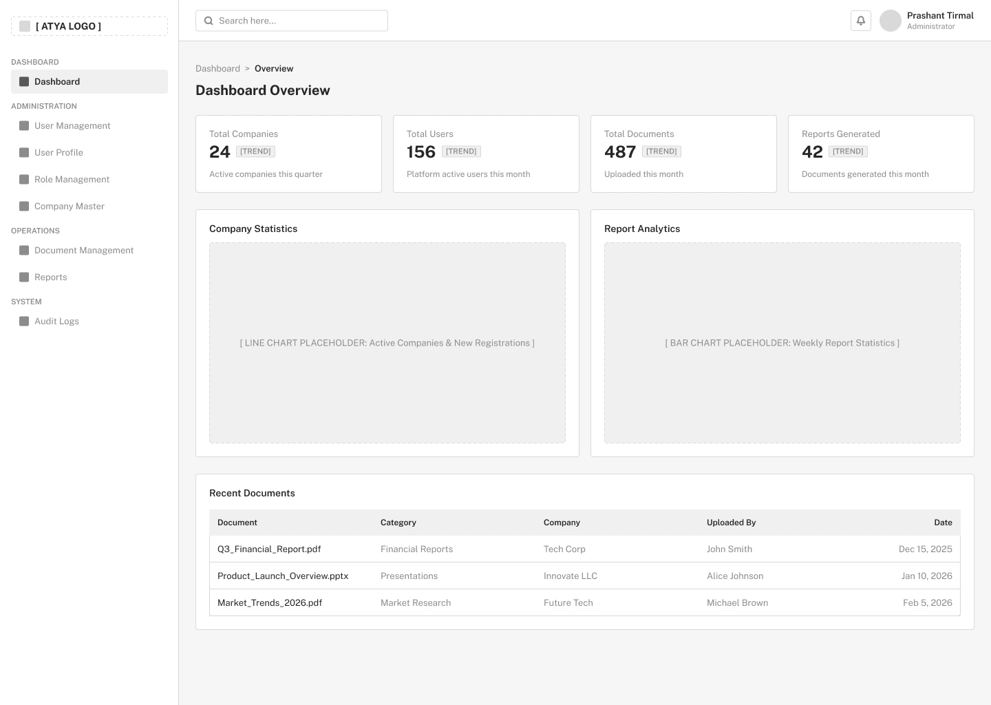
Summary cards, chart areas, and recent records establish the reading order.
View screen ↗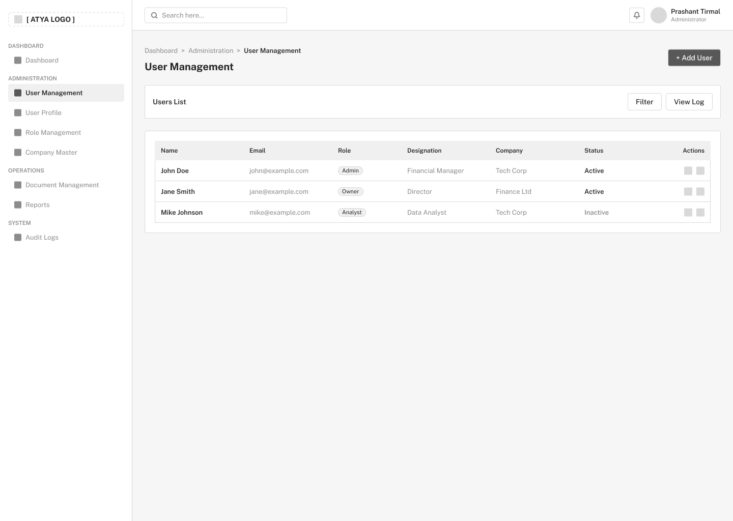
The table gives identity, role, company, and account status consistent positions.
View screen ↗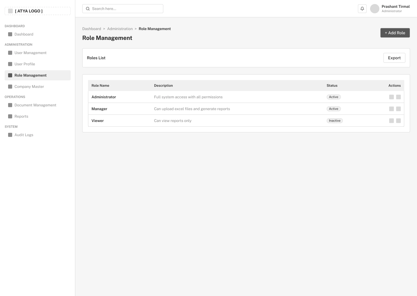
Roles get their own list so permissions can be managed separately from individual users.
View screen ↗Carry the pattern across administration
The finished layouts share navigation, table structure, and action placement. That consistency matters when the same person moves repeatedly between companies, people, and permissions.
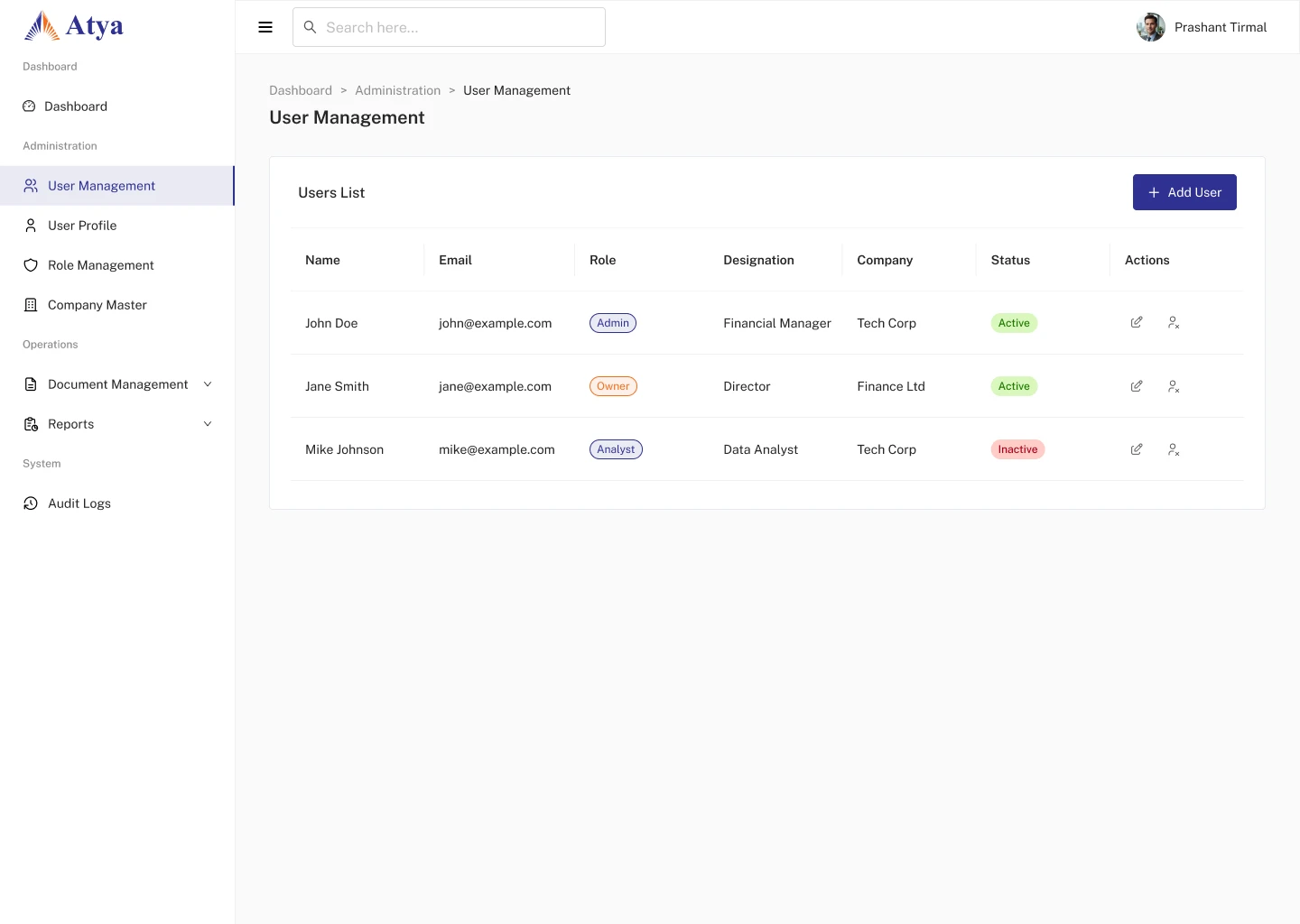
People and their account details follow one scanning pattern.
View screen ↗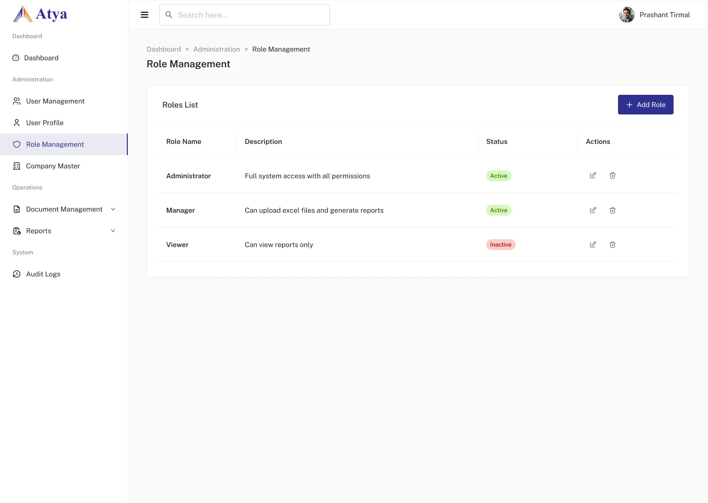
Related controls extend the same visual language to permissions.
View screen ↗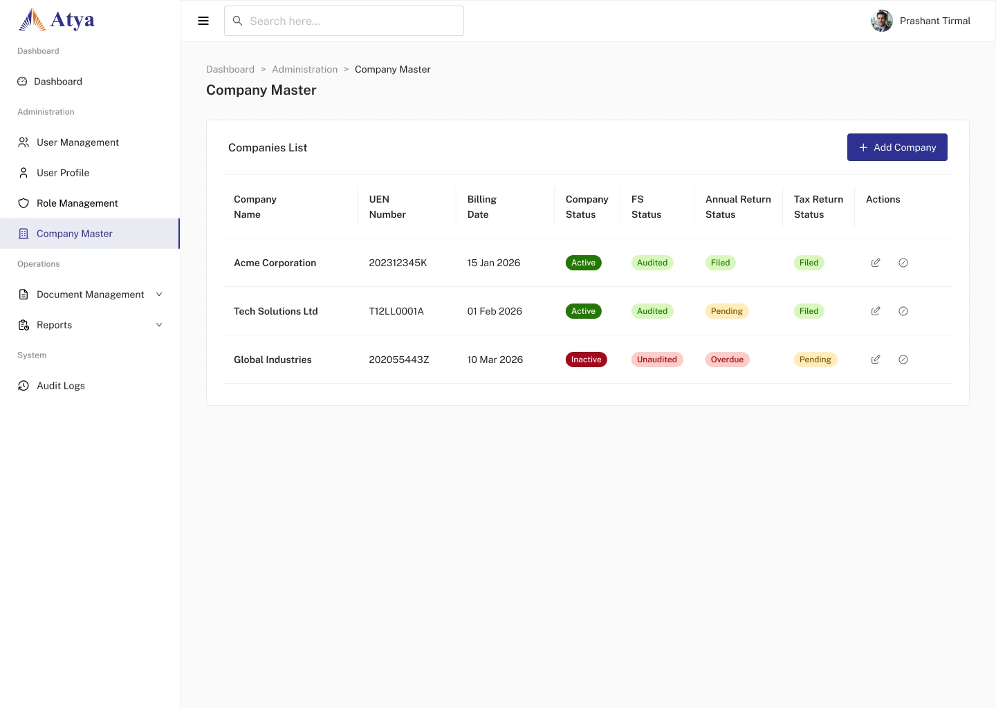
Company information and reporting statuses appear together in the administrative list.
View screen ↗Consider work away from the desktop
The mobile exploration reorganizes a content-heavy task into a narrow layout, with topic selection followed by editing.
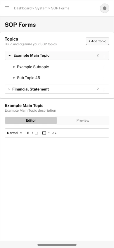
The source wireframe stacks topic navigation and the editing area.
View screen ↗07 / DESIGN INTO DEVELOPMENT
Carrying the patterns into HTML.
Dashboard cards and management tables should share spacing, typography, and status conventions. Long lists need predictable filtering and empty states; row actions should remain reachable with a keyboard and should identify the record being changed.
Users and permissions in HTML
The frontend uses a shared sidebar and card layout, with the user list in the main workspace. The table carries name, email, role, designation, company, and status into the implementation.
08 / REFLECTION
Consistency across the administrative work.
The dashboard and management screens form a common interface language. The relationship between users and roles, the clarity of row actions, and the meaning of each chart would be the next areas to test.
I would test the distinction between users and roles, discoverability of row actions, and recovery from an accidental edit. Chart comprehension should be checked separately from visual appeal.