01 / THE CHALLENGE
People do not all begin with a product name.
A shopper might start with a birthday, a delivery date, or a particular bouquet. FloraFusion combines product and occasion-based browsing, with search for people who know what they want.
Gifting is emotional, but delivery and product details are practical. The page needs to make room for both: enough atmosphere to invite browsing and enough information to support a decision.
02 / MY ROLE & APPROACH
Shaping the catalogue for desktop and mobile.
I developed a storefront direction for desktop and mobile. The work covers how people enter the catalogue, how products are presented, and how the same shopping structure adapts to a narrower screen.
Project timeline · design phases
- 01
Frame the task
Support occasion-led and product-led shopping.
- 02
Organize the experience
Arrange discovery, collections, and service content.
- 03
Resolve the interface
Design product cards and the desktop storefront.
- 04
Prepare for execution
Adapt navigation and catalogue sections for mobile.
03 / INFORMATION ARCHITECTURE
Different routes into the collection.
The main areas of the product, and the information each one needs to keep together.
Find a gift
- Delivery location
- Search
- Categories & occasions
Browse collections
- Deals
- Best sellers
- Product cards
Supporting content
- Customer testimonials
- Editorial stories
- Service information
04 / USER FLOW
From browsing to a product.
A useful flow needs to account for what happens when someone cannot take the next step immediately.
- 01Set delivery context
- 02Browse by intent
- 03Compare products
- 04Choose a gift
No specific product in mind?
Start with an occasion or collection, then compare individual gifts.
05 / DESIGN DECISIONS
Giving the flowers room to lead.
Offer several useful starting points
Categories and occasions sit alongside search and delivery-location information. These routes support different shopping intentions without requiring separate storefronts.
Make similar products easy to scan
Product cards keep imagery, names, prices, and review information in consistent positions. Deals, best sellers, and collections reuse that pattern.
Keep the products central on mobile
The mobile design carries the same catalogue into a vertical layout. Compact navigation and stacked sections leave room for product imagery without losing the browsing structure.
06 / THE WORK
A closer look at the details.
Explore the screens below. Scroll through a longer page or open it for a closer look.
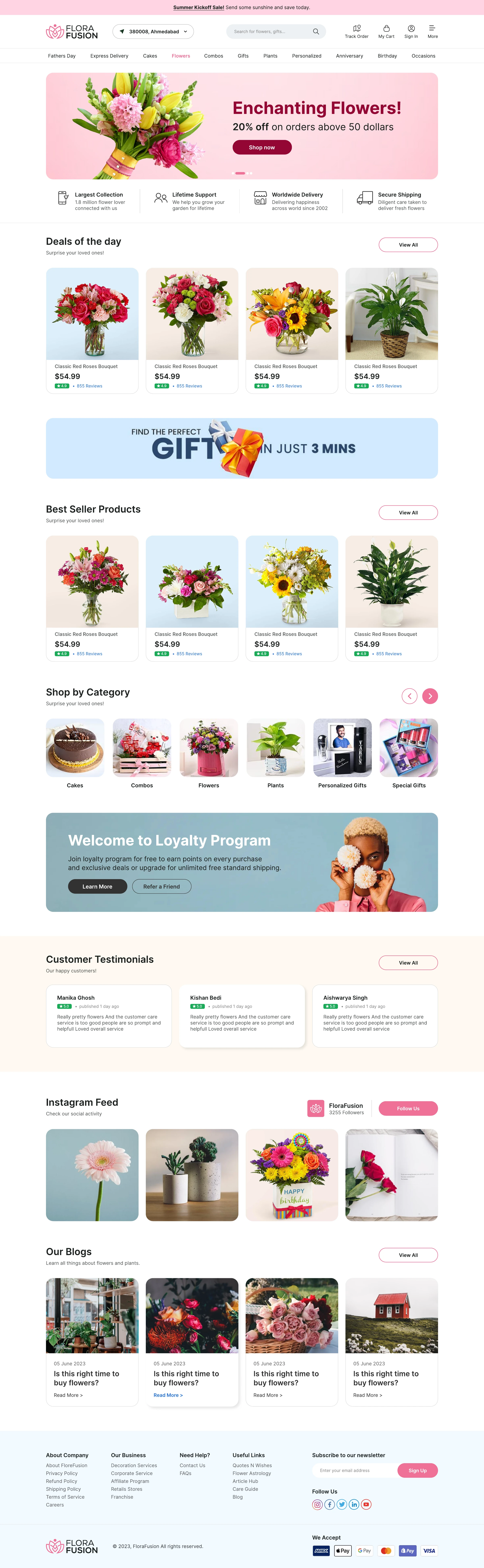
Occasions, offers, and product collections create different routes into the catalogue.
Open full design ↗
The original mobile design adapts discovery, product cards, and supporting content.
Open full design ↗07 / DESIGN INTO DEVELOPMENT
A responsive catalogue that holds together.
Product imagery should retain consistent proportions while names and prices remain readable. Mobile navigation and collection rows need touch-friendly controls. Delivery eligibility should be confirmed before a shopper invests time in a product that cannot be delivered.
08 / REFLECTION
One catalogue, across two screen sizes.
The concept covers discovery and supporting content on desktop and mobile. Delivery eligibility and the path into checkout would be the next pieces to resolve. Prices, reviews, and promotions in the artwork are sample content.
I would test finding a gift for a specific date, understanding delivery eligibility, and comparing similar products. Product names, review figures, and promotions shown in the concept are sample interface content.